
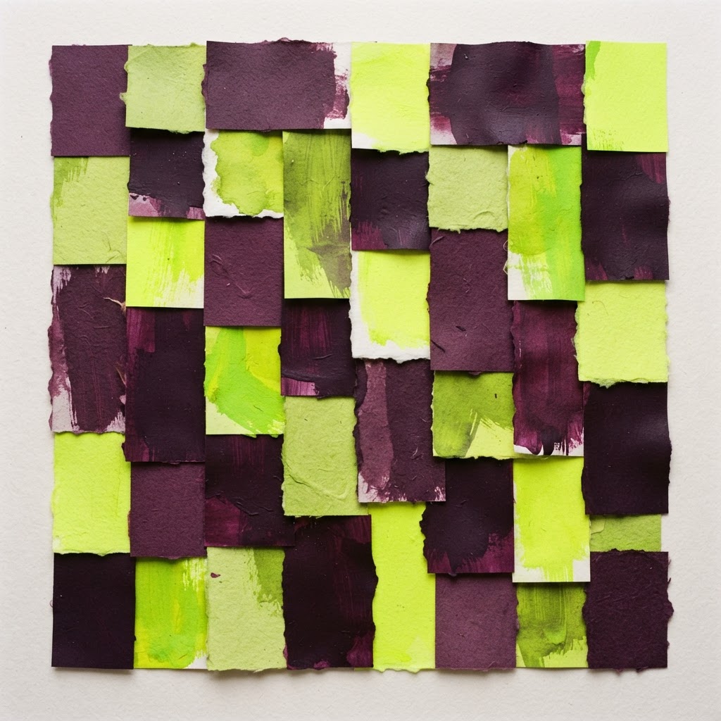
The Year Color Got Loud Again
Muted beige had a good run. What is replacing it is not a palette so much as a posture: brands reaching for color that behaves like a signal, not a backdrop.
For the last few years, brand work leaned quiet. Warm neutrals, generous white space, thin type. It read as tasteful, and it made almost everything look like almost everything else.
That is changing, and it is changing fast.
Saturation as a signal
The brands getting attention right now are not using color politely. They are using one loud hue, committed to it fully, and letting it do the work of recognition. A single acid green. A slab of hot orange. Color that functions the way a logo used to.
The reason is practical: feeds are crowded and short. A palette you have to look at for two seconds to appreciate is a palette that loses. A palette you register in a quarter second wins.
What this means for smaller brands
You do not need a rebrand to use this. You need one color you own, used with discipline:
- Pick a hue your category avoids, and take it seriously.
- Use it on one element at a time so it stays loud instead of becoming wallpaper.
- Keep the rest of the system quiet so the color has something to push against.
The trap
Loud color is not the same as many colors. The failure mode is a palette of five competing brights and no hierarchy, which reads as noise rather than identity. One committed hue, one neutral, one contrast, and the discipline to stop there.
That is the whole trend. Color was never decoration. It was always the fastest thing a brand can say.